Gallery
The system behind this website
No stock photography and no pictures of a meeting room. What follows are the actual design artefacts this site was built from — the colour tokens, the type scale, the component states and the contrast audit.
Why these
SBPO Consulting photos: a note on what you are looking at
Most agency galleries are a grid of laptop mockups and office interiors bought from a stock library. We would rather show you something you can actually verify: the design system underneath the page you are reading, with the real values in it. Every ratio quoted below can be checked against this site with a browser inspector.
As client projects are published with permission, they will appear here alongside these specimens and be labelled with what they are. We do not publish client work without written consent, and we do not present concept work as though it were commissioned.
-
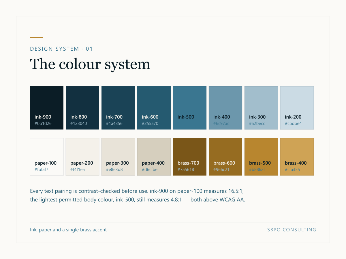
The full colour system used to build this website. One accent, a warm paper ground rather than pure white, and every pairing contrast-checked before it was used anywhere. -
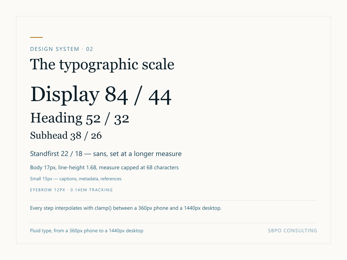
Seven steps, each interpolating fluidly between mobile and desktop with clamp(). A serif for display, a tight sans for text, and a body measure capped at 68 characters. -
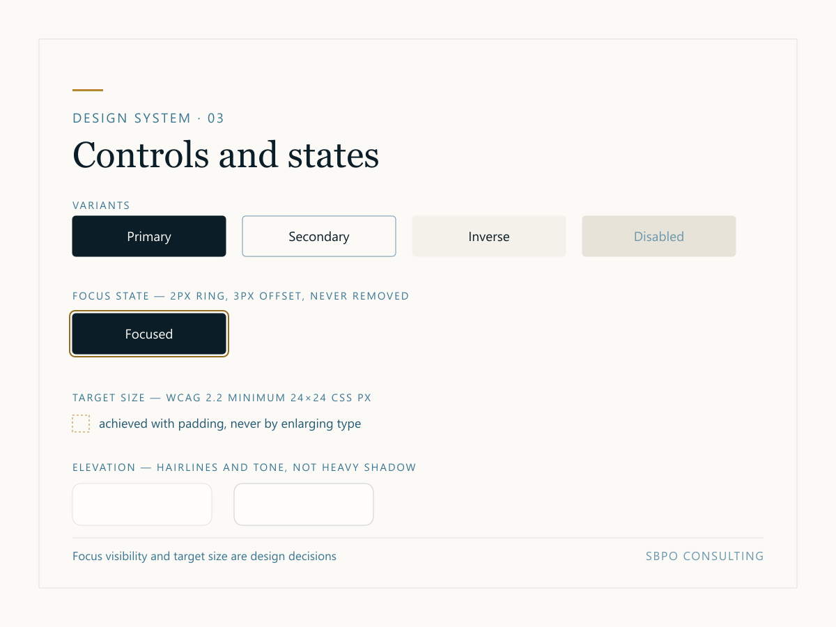
Every interactive component is designed in all of its states, including focus and disabled. The focus ring is defined once for the whole site and is never removed. -
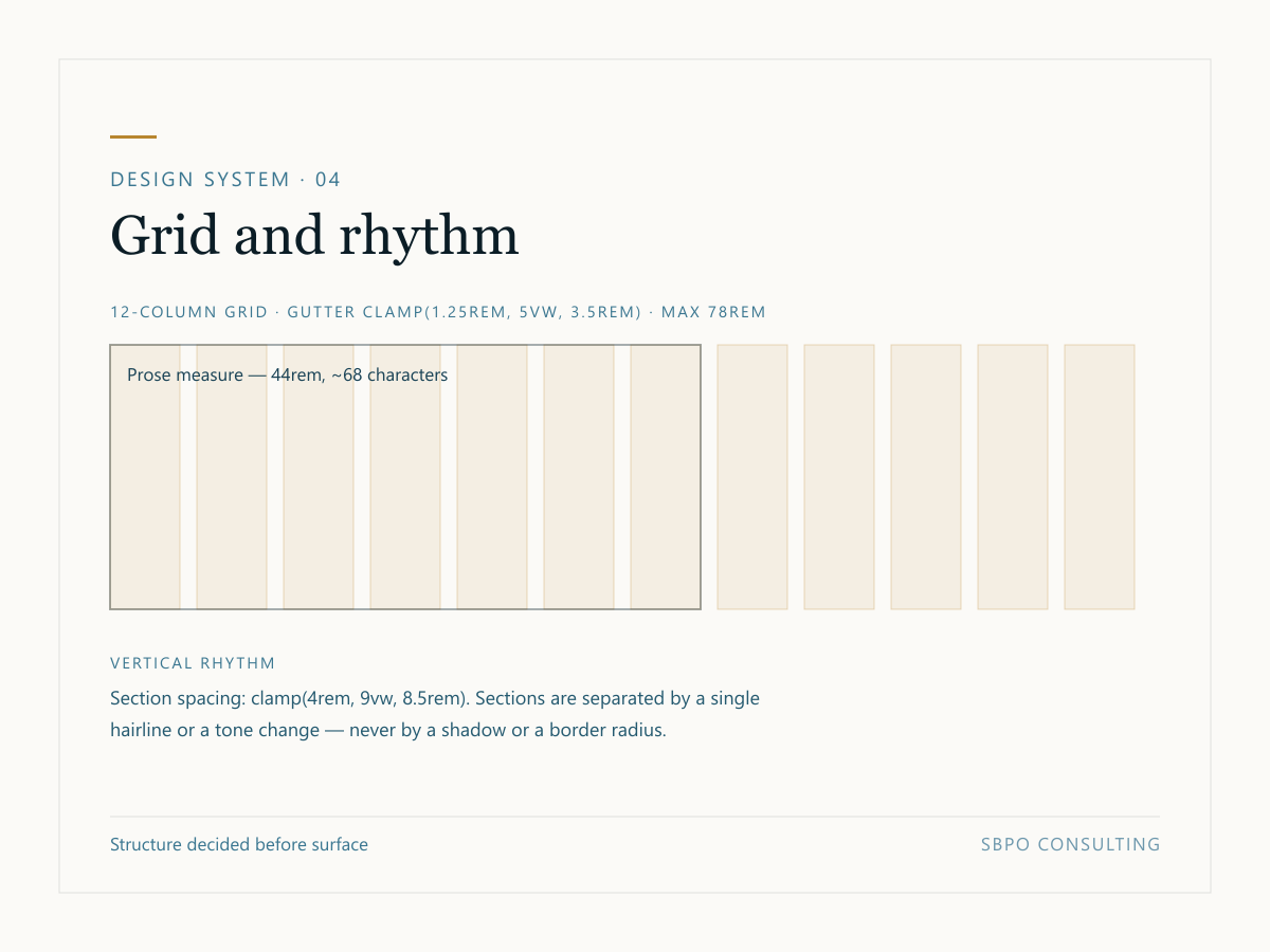
The grid the whole site is composed on, with the prose measure overlaid. Sections are separated by a hairline or a change of tone — never by a shadow. -
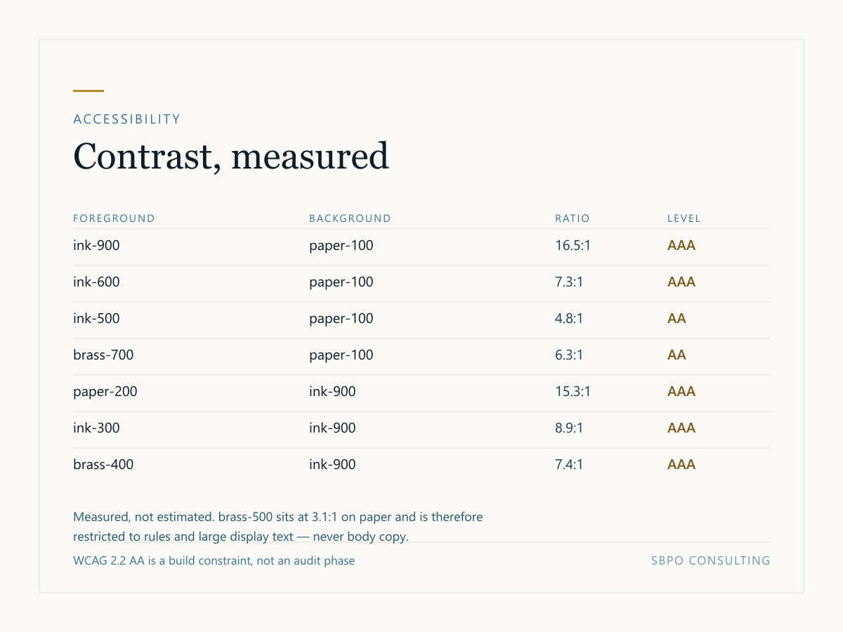
The contrast audit for this site. Every ratio was calculated numerically rather than judged by eye, and the palette was chosen around the thresholds rather than adjusted to fit them afterwards. -
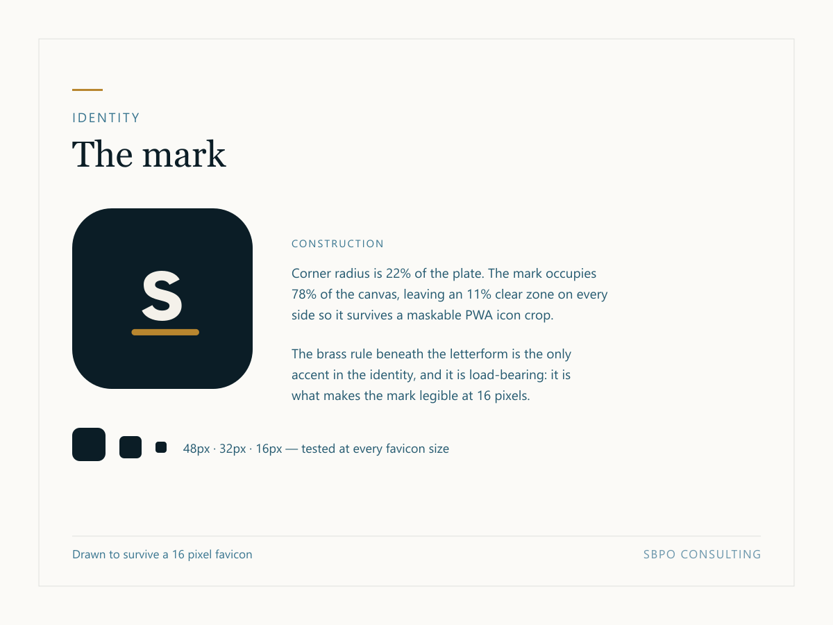
The identity mark and its construction. Every raster asset on this site — favicon, touch icon, PWA icons, and the logo in the structured data — is generated from this one source file so they cannot drift apart.
Licence
Using these images
These specimens are © SBPO Consulting. You are welcome to reference them in writing about this site with attribution and a link. Please do not present them as your own work or as the output of a different studio.
Full terms are on the terms of service page. If you want to use one of these in an article or a talk, just ask — the answer is almost always yes.
Gallery
Want this level of rigour on your own project?
Every engagement produces artefacts like these, and they are yours at handover — not locked in a tool you cannot access.